Using the Email builder, you can format emails for mobile devices.
Navigation
Step 1: Edit a Mobile Design for Your Email
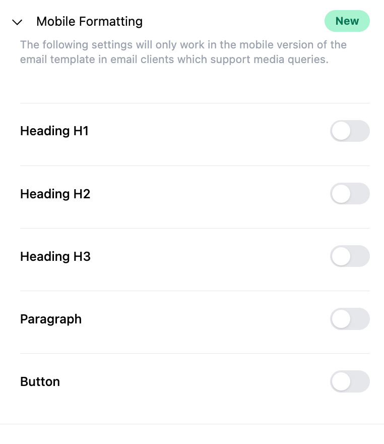
- Once you’ve created an email template or email campaign, click into the “Appearances” tab and select the Mobile Formatting dropdown menu

- Under Mobile Formatting, customize the options for font height, styles, and alignment. To view these enable any toggle that you would like to edit for Heading H1, Heading H2, Heading H3, Paragraph, and Button
NOTE: There are default styles that include font size and line height settings - they will work on smaller screens for the Design Editor, and you can make customizations anytime.


- Once you’ve made your customizations, save your changes.
Step 2: Preview and Test Your Email Campaign
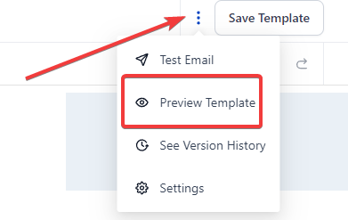
- Click the 3-dots menu and choose “Preview Template” to preview your mobile view.

- You can also preview it on a mobile device to see in real time how it will appear.
- When you are redirected to the preview screen, you can toggle between the icons at the top to preview in desktop, tablet, or mobile device view.
Mobile Formatting Best Practices:
Configuring Mobile Emails
Key considerations include:
- Single-Column Layout: Enhances readability on smaller screens, ensuring a seamless user experience.
- Image Optimization: Balances image quality and file size, incorporating responsive images for automatic adaptation.
- Touch-Friendly Buttons: Ensures interactive elements are easily tappable, enhancing user engagement.
- Concise Text and Clear CTAs: Simplifies content, utilizing bullet points and subheadings for readability. Clear, concise CTAs in the middle of the screen enhance user interaction.
- Responsive Email Design: Guarantees adaptability across diverse devices, offering a consistent experience.
- Preview and Testing: Validates email display across various devices and email clients, ensuring accurate rendering.
- Incorporating White Space: Enhances email clarity, making it visually appealing and user-friendly.
- Font Size and Accessibility: Maintains legible font sizes, using accessible color contrasts and alt text for images.
Mobile Formatting
In today's world, your emails must look good on all devices. With that in mind, the Email Builder Inline Editor provides a special section for mobile formatting.
Here, you can specify which headings, paragraphs, and buttons should be visible when your email is viewed on a mobile device. This ensures that your emails are optimized for both desktop and mobile viewing.
Email Mobile View Configuration Best Practices:
When configuring mobile emails, you need to pay close attention to a few key areas that contribute to the overall usability and effectiveness of your emails:
- Use a Single-Column Layout: Single-column layouts work best for mobile as they are easier to scale down for smaller screens. Multiple columns can get cluttered on a mobile screen and may be confusing for users to navigate.
- Optimize Images: Ensure your images are of high quality but also keep the file size small for quick loading. Consider using responsive images that will automatically adjust to fit the screen they're viewed on. Don't forget to include alt text for accessibility.
- Touch-Friendly Buttons: On mobile devices, your CTAs will most likely be tapped with a finger rather than clicked with a mouse. Ensure your buttons are large enough to be easily tapped - a minimum size of 44px by 44px is recommended.
- Limit Text Amount: On mobile devices, lengthy text can be daunting. Be concise and break your text into small, manageable chunks. Make use of bullet points and subheadings for easy readability.
- Use a Responsive Email Design: This will ensure that your email will automatically adjust to fit the screen of any device it's viewed on.
- Preview and Test: Always preview and test your emails on different devices and email clients to ensure they display correctly.
- Include White Space: White space isn't wasted space. It makes your email cleaner and easier to read on a small screen.
- Font Size and Style: Keep your font size large enough to be readable on small screens. A size of 14 for text and 22 for headlines is often recommended. Avoid fancy fonts that might be difficult to read.
- Clear and Concise CTAs: Make sure your call-to-action is clear, concise, and easy to find. The best place for a CTA button is generally in the middle of the screen.
- Optimize Subject Lines and Preheader Text: Keep your subject lines short and engaging, and utilize the preheader text to provide a summary or teaser of your email content. It's also a good idea to A/B test different versions of subject lines to find what works best for your audience.
- Opt for Plain Text Over Images: Some email clients may not automatically display images. To ensure your message gets across, use text as much as possible and only use images when necessary.
- Unsubscribe Option: Make it easy for recipients to opt out of your emails. Not only is this a legal requirement, but it also improves user experience.
- Accessibility: Make your email accessible to everyone. This includes using larger fonts, ensuring good contrast between text and background, and including alt text for images.
Remember, the best practices for mobile email configuration may vary depending on your specific audience and the type of content you're sending. Always test different approaches to see what works best for your audience.
Here are some resources that could help further consolidate the mobile email design best practices:
Mobile Email Design Further Reading: https://www.emailonacid.com/bl...
Utilizing Colors in Email Design Further Reading: https://www.creativebloq.com/i...
Optimize Images for Mobile Use Further Reading: https://www.sendinblue.com/blo...
Tips for CTA Design Further Reading: https://unbounce.com/email-mar...
Best Use of Space Further Reading: https://stripo.email/blog/emai...
Best Use of Scroll Further Reading: https://www.campaignmonitor.co...
Is A/B Testing Emails Necessary? Further Reading: https://sendpulse.com/blog/ab-...
Accessibility Guidelines for Emails Further Reading: https://www.emailonacid.com/bl...
Mobile-friendly Vs. Responsive Email Design Further Reading: https://litmus.com/blog/unders...
Mobile Email Configuration Best Practices Further Reading: https://www.mailup.com/resourc...
FAQ’s
How can I format emails for mobile devices using the Email Builder?
To format emails for mobile devices, navigate to the "Appearances" tab in your email template or campaign and select the Mobile Formatting dropdown. Customize font height, styles, and alignment for headings, paragraphs, and buttons to ensure your email looks great on mobile screens. Save your changes and preview the email in mobile view to see how it will appear on smaller devices.
What are some best practices for configuring mobile emails?
Best practices for mobile emails include using a single-column layout for better readability, optimizing images for quick loading and responsiveness, creating touch-friendly buttons, and keeping text concise. Ensure your email design is responsive to adapt across different devices, incorporate white space for clarity, use legible font sizes, and maintain accessible color contrasts. Always preview and test your emails on various devices to ensure proper rendering.
How can I make sure my call-to-action (CTA) buttons are effective on mobile devices?
For effective CTA buttons on mobile devices, ensure they are large enough to be easily tapped, ideally at least 44px by 44px. Place the buttons prominently, usually in the middle of the screen, and make them clear and concise. Test different versions of CTAs to see which perform best with your audience.
Why is using a single-column layout recommended for mobile emails?
A single-column layout is recommended for mobile emails because it simplifies scaling for smaller screens, making the content easier to read and navigate. Multiple columns can appear cluttered and confusing on mobile devices, so a single-column layout helps create a cleaner, more user-friendly experience.
How do I optimize images for mobile email?
To optimize images for mobile emails, ensure they are of high quality but have a small file size to reduce loading times. Use responsive images that automatically adjust to fit the screen they’re viewed on. Include alt text for accessibility, and avoid relying solely on images to convey your message, as some email clients may not display images by default.
Was this article helpful?
That’s Great!
Thank you for your feedback
Sorry! We couldn't be helpful
Thank you for your feedback
Feedback sent
We appreciate your effort and will try to fix the article
